iOS 7 Review: Apple Loses its Core
Every year Apple releases a new iPhone and iOS. It is arguably the biggest event in the technology world for the year. iOS 7, “The mobile OS from a whole new perspective,” according to Apple’s website, was downloaded by 32% of Apple devices in the United States and Canada.
That 32%, including me, were met by a mobile OS from a “whole new perspective,” but it was the wrong perspective. Now, it wasn’t all bad. So I’m going to start out with the good.
To me, the greatest improvement is simplest concept: Control Center. With previous iterations of iOS, users were forced to go to settings to access Wifi, Airplane Mode, Bluetooth and Do Not Disturb. In addition, users needed a flashlight application to use their camera flash as a flashlight.
Now, with a simple swipe up from the bottom of the screen, users have access to all of these, plus music, portrait orientation, compass, calculator and the camera, along with AirDrop, a new feature on the iPhone which allows you to share files via Wifi.
This uncomplicated feature will make the iPhone easier to use, and help save battery by allowing users to reach the exact brightness they want and turn Bluetooth on and off as needed, rather than leaving the brightness at the highest level and the bluetooth on constantly.
The next biggest improvement is in the music application. With the addition of iTunes Radio, Apple took the idea of Pandora and made it better. iTunes Radio offers stations that only include Top 100 list songs, making it so the songs you want to hear come up more often, rather than having to wait through tracks you dislike when using Pandora.
With iTunes Radio, Apple has offered a more seamless way to listen to your favorite music “Stations,” as users no longer have to download a separate application. And, if you hear a song you like, you can buy it directly off of iTunes with a simple tap, and it is added to your music library.
iTunes Radio is located in the bottom left of the music application.
To me, the well-done major changes end here.
And the list of bad begins here.
Right off the bat, I had a gripe with the top bar for all of the pages: Apple removed the traditional “bars” to show service quality, and replaced them with small circles. Saying “I have three bars of service,” makes sense to me. Saying “I have three dots of service?” Doesn’t quite work the same way for me.
The next problem is when you slide on “slide to unlock.” If you have a passcode set, you are faced with what, to me, amounts to the same lock screen as an Android. There are circles in a three by three pattern, plus the zero on the bottom. With Android, you have this same three by three pattern of circles.
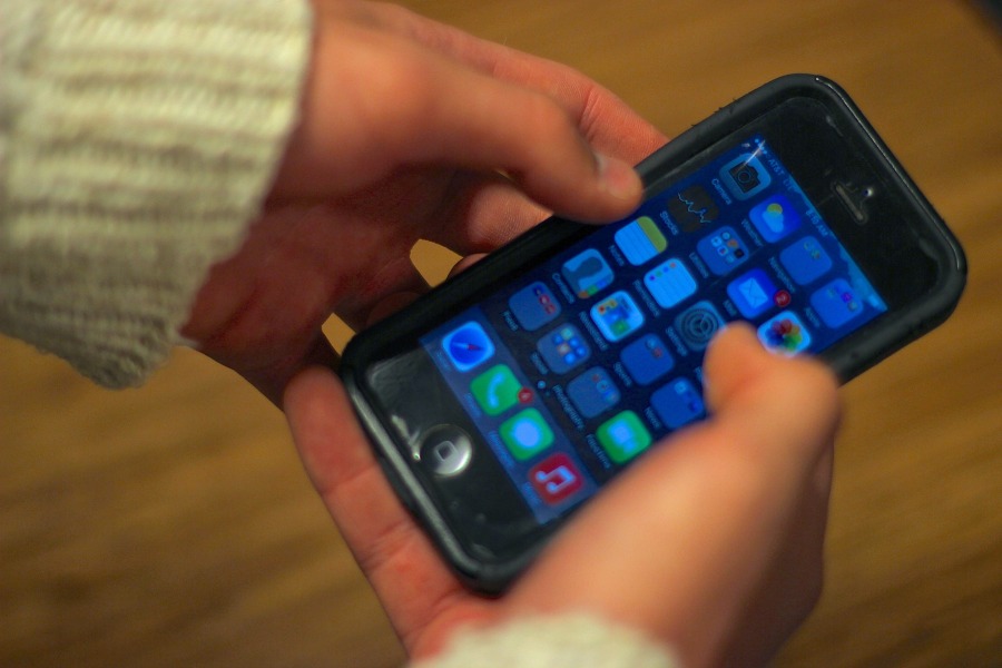
From here, things only get worse. The home screen looks like a hybrid between Windows 8 mobile and Android. It is flat like Windows, and slightly robotic like Android. It really is a boring look, most clearly illustrated by the camera and weather icons: a black camera and a grey background and a blue background with a circular, yellow sun behind a boring cloud, that looks like three circles put together.
Overall, the home screen lacks what was so great about the old iOS’s: things seemed simple, but had a touch of reality. Apple moved away from the hints of reality, like the green felt background for GameCenter and the binder icon for the contacts application, and it, to me, is just not as fun. They focused on simplicity, and to me it moved away from what I know and love about Apple, which is the intuitive nature of their products because of the touches of non-technological design. I will thoroughly miss these design cues.
Overall, I am most disappointed with the lack of uniformity. Let’s look, for example, at the camera application. This app looks like a robotic control center. It has black edges, with yellow text as you slide from camera mode, to video mode and the other modes. It is very cluttered, and the design is overbearing, which, for an app designed to capture beautiful combinations of colors and scenes, makes no sense. It should be simple, and let the scenery be the center of attention.
But, when you go to notes, you are presented with a blank, white sheet of paper, with no lines. I would much rather have a simple camera app than a simple notes application. I want lined paper, not a robotic camera. To me, the difference in these two is a prime example of the failure in uniformity, something that has made Apple products simple, until now.
I could gripe on and on about the design problems, but I will leave it at this: the home page looks slightly childish, as you have a weird mix of various colors, and the flat design could have been made by a run of the mill toddler.
As far as functionality problems, there isn’t too much. On Safari, you can no longer find out how many tabs you have open, and Calendar is sometimes confusing, but the real functionality problem lies within the design, as the design makes the phone more difficult to use.
In the end, I would give iOS 7 a C at best, simply because making a big design change was a gutsy move by Apple, but giving them anything higher would be ridiculous because the gutsy design change just made the design flawed.
Your donation will support the student journalists of Omaha Westside High School. Your contribution will allow us to purchase equipment and cover our annual website hosting costs.


